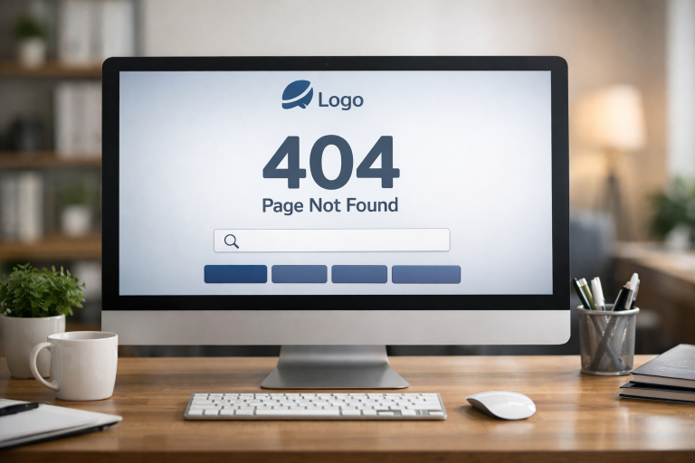
Encountering a 404 error page can be frustrating for website visitors. However, when designed thoughtfully, these pages become opportunities to enhance user experience rather than interrupt it. With the right approach, you can turn a simple 404 page into a touchpoint for trust and engagement. An excellent way to start learning about effective strategies is by exploring collections of 404 page design, which showcase creative and user-friendly examples from across the web.
404 pages do not have to be digital dead ends. By prioritizing clear communication, seamless navigation, and a touch of personality, you can keep users engaged, even when something goes wrong. Not only can this approach reduce bounce rates, but it also reflects positively on your brand and encourages visitors to continue exploring your site.
Beyond aesthetics, a well-constructed 404 page signals professionalism. It subtly reassures your audience that you care about their journey, even in the face of potential problems. Pairing clear design with relevant links or search tools can turn a negative moment into a pathway back to valuable site content.
With just a few key features and ongoing attention, even missed clicks and broken links can reinforce a sense of care and attentiveness. This guide explores best practices and strategies for making your 404 pages work for you and your audience. For further insights into web usability and navigation, explore detailed guidelines from established sources such as the Nielsen Norman Group.
Crafting a Clear and Concise Error Message
When visitors land on a 404 error page, the most important first step is to deliver a clear, understandable message. Avoid confusing the user with technical terminology. Simple phrases like “Sorry, we couldn’t find that page” or “This page does not exist” not only remove ambiguity but also help users quickly understand the next steps.
Direct language efficiently manages user expectations and prevents additional frustration, which is crucial in retaining user trust. Remember, even a gentle explanation such as “It seems the page you’re looking for isn’t here right now” can foster a more forgiving attitude from your audience.
Maintaining Consistent Branding
Consistent branding on your 404 error page reassures visitors they are still within your trusted environment. Use your site’s color schemes, typefaces, and logo just as you would on any other prominent page. This level of consistency makes the experience less jarring and demonstrates professionalism even when the user journey is interrupted.
Branded illustrations, mascots, or tone of voice can also enrich your messaging, turning even an error page into a brand touchpoint. A well-branded 404 page signals that your organization pays attention to detail and values every visitor interaction, no matter the circumstances.
Providing User-Friendly Navigation Options
A 404 page should not trap visitors. Instead, include links to your homepage, a list of popular sections, or even recent news and articles. Providing these exit routes gives users multiple ways to get back on track, reducing abandonment rates and keeping them in your site’s ecosystem.
Clear calls to action encourage people to explore further rather than leave the site altogether. The more intuitive and accessible your navigation from the error page, the more likely users remain engaged beyond their initial mistake.
Incorporating Search Functionality
A search bar on your 404 error page is one of the most effective ways to help users find what they are seeking. With a well-placed search box, visitors can type in keywords or topics and continue their journey without having to backtrack or guess where to navigate next.
This feature greatly reduces frustration, improves the user experience, and can boost overall site stickiness. For more inspiration, review case studies and analytics on search-driven navigation from respected web development resources like Smashing Magazine.
Utilizing Engaging Visuals and Humor
Creative visuals, animations, and a dash of humor can transform what might have been a negative interaction into a pleasant surprise. Graphics or clever illustrations reflecting your brand personality can turn a user mishap into a memorable touchpoint. Many well-designed 404 pages use playful imagery or witty captions to foster goodwill and encourage sharing, thereby strengthening positive brand associations.
Humor not only lowers frustration but also encourages users to linger, reinforcing your site as user-friendly and approachable. Visual engagement breaks up the monotony of error messages and can even motivate users to explore more of your content.
See also: Why Legal Representation Matters in Family Law Conflicts
Monitoring and Analyzing 404 Errors
Actively monitoring 404 errors is essential for maintaining site health. Regularly review web analytics and server logs to identify which URLs trigger the most errors. Tools like Google Search Console provide detailed reports on broken links and user paths, enabling you to fix them or add necessary redirects promptly.
By understanding how often and why users encounter these errors, you can make targeted improvements. This ongoing attention can lead to a smoother user experience and stronger overall site performance, ultimately resulting in higher satisfaction and loyalty from your visitors.
Implementing these strategic approaches can elevate your 404 pages from afterthoughts to powerful elements of customer experience. Every detail counts, and even error pages are a chance for your brand to shine.