Key Takeaways
- Build menus around visitor goals instead of internal company structure.
- Use plain, familiar labels that explain what each destination contains.
- Plan mobile, accessibility, speed, and testing from the beginning.
- Keep the main menu focused, consistent, and easy to scan.
- Use real visitor feedback to uncover confusing paths and missing links.
Website navigation should help people move from a question to an answer with as little effort as possible. Whether you are reviewing a simple nav bar or planning a large content hub, the goal is the same: make important destinations easy to notice, understand, and reach.
Start With User Goals, Not Menu Styles
Do not begin by choosing dropdowns, icons, or animations. Begin by asking what visitors need to do. They may want to understand an offer, compare services, check pricing, find a policy, get support, or contact the right team. A menu organized around those tasks is usually more useful than one based on internal departments.
For example, “Services,” “Pricing,” and “Support” give a first-time visitor stronger direction than labels such as “Solutions,” “Resources,” or “Our Ecosystem.” Clever language can work in brand messaging, but navigation needs to remove guesswork.
Build a Clear Information Structure
Information architecture is the practical structure that organizes pages, labels, search, and navigation so people can find what they need. A strong information architecture groups related questions together instead of treating every page as equally important.
Create a simple sitemap before designing the header. Identify parent pages, supporting pages, and pages that deserve direct access. The main menu should show major paths, not every page on the site.
Suggested Planning Steps
- List the pages that matter most to visitors and the business.
- Group pages that answer similar questions or support the same task.
- Name each group with clear language.
- Remove duplicate, outdated, or low-value links.
- Ask a few people to find key pages without assistance.
Write Labels People Can Understand
Menu labels should be short, specific, and easy to interpret on their own. “Contact,” “Shipping,” “Case Studies,” and “Account” are generally clearer than vague labels that require visitors to explore before understanding their meaning. Keep grammar consistent, too. If one item is a noun, avoid making the next item an unrelated command unless it is a clear primary action, such as “Book a Demo” or “Get Help.”
Label Review Checklist
- Can a new visitor predict what the page contains?
- Does the label match the page heading?
- Is it short enough to scan quickly?
- Does it make sense outside its menu context?
- Will it still work as the site expands?
Choose the Right Menu Pattern
A simple horizontal menu works well for small sites with a handful of destinations. Dropdowns can organize supporting pages, while mega menus can help visitors browse larger catalogs, educational libraries, or multi-category stores. Side navigation is useful for documentation and account areas. Tabs work best for closely related sections, and search-led navigation can be essential when visitors arrive looking for a specific item.
No pattern is automatically better than another. The right choice depends on how much content exists, what visitors are trying to find, and how often the structure changes. Large menus need stronger grouping and a visible hierarchy. Small sites should avoid complexity that adds no value.
Design for Mobile From the Start
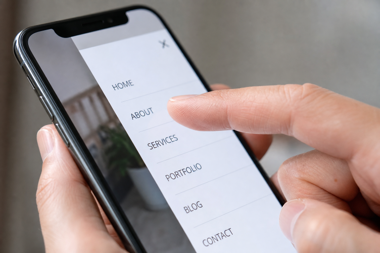
A mobile menu is not a desktop header squeezed into a narrow screen. Touch controls need enough space, text needs to remain readable, and open and close actions need to be obvious. Put the most important destinations near the top, especially if a menu contains several sections.
Test the experience in portrait and landscape views. Open the menu one-handed, expand every submenu, return to the home page, and repeat the process on a slower connection. Sticky headers can help visitors regain orientation on long pages, but they should not take up too much screen space or cover content.
Make Navigation Accessible
Accessible navigation makes a site easier for everyone, including keyboard users, screen reader users, people with limited dexterity, and visitors navigating in a hurry. Use semantic HTML navigation regions, logical tab order, visible focus styles, and a skip link that lets keyboard users bypass repeated header content.
Menus should not rely on hover alone, and custom controls should behave predictably. The Web Content Accessibility Guidelines offer a useful framework for checking keyboard access, focus visibility, contrast, and understandable interaction patterns.
Use Visual Hierarchy Without Clutter
Spacing, contrast, type size, and grouping help people scan a header quickly. Give the main action more emphasis than secondary links, but do not turn every item into a bright button. Too many colors, icons, badges, and animations create competition instead of clarity. A calm header can make even a complex site feel manageable.
Keep Navigation Consistent Across the Site
Visitors should not have to relearn the interface on every page. Keep the menu in a familiar location and use the same behavior for dropdowns, search, account links, and close buttons. Reusable components help teams maintain consistency as the site grows. Calling the same action “Support” on one page and “Help Center” on another can create unnecessary doubt.
Connect Navigation With Content Discovery
The header is only one part of the navigation. Breadcrumbs show location, page headings confirm purpose, related links suggest a next step, and search helps visitors bypass the menu when they know what they need. Content-heavy sites benefit from visible topic groupings and clear paths back to broader categories.
Treat Speed as Navigation Quality
Slow menus, shifting layouts, and delayed page loads interrupt the sense of direction. Keep scripts lightweight, compress unnecessary images, and test interactions on older phones and slower networks. Motion can provide useful feedback, but it should never delay access to a menu or make visitors wait for basic controls.
Test Navigation With Real People
Internal teams know where everything is, which makes them poor judges of first-time findability. Run short task-based tests instead. Ask participants to find pricing, compare two options, locate a cancellation policy, reach support, or contact the correct department. Watch for hesitation, wrong turns, long completion times, and abandoned tasks. Analytics and heatmaps can support those findings, but they cannot explain why someone became confused.
Common Mistakes to Avoid
- Using vague labels and too many top-level links.
- Hiding essential pages behind unclear icons.
- Creating dropdowns that only work with a mouse.
- Removing focus indicators or making mobile menus difficult to close.
- Changing names and interaction patterns across templates.
- Adding motion that slows access to content.
- Skipping testing because the design looks polished.
See also: Why Legal Representation Matters in Family Law Conflicts
A Practical 2026 Navigation Checklist
- Map key pages around visitor goals.
- Use short, familiar labels and a focused main menu.
- Design mobile navigation as a complete experience.
- Support keyboard, screen reader, and touch users.
- Show active states and visible focus states.
- Keep patterns consistent across every template.
- Test performance on real devices and connections.
- Run task-based usability tests before and after launch.
Conclusion
Good website navigation does not need to feel clever. It needs to feel obvious. When it reflects real visitor goals, uses clear language, works across devices, and supports different access needs, people can focus on the content and actions that matter. The strongest navigation systems stay simple, fast, consistent, and regularly tested.