Today’s consumers expect a flawless checkout experience on their mobile devices. With over 60% of e-commerce traffic coming from smartphones and tablets, businesses that neglect mobile optimization for their checkout process risk losing valuable conversions. The design and usability of a checkout screen can make the difference between a completed sale and an abandoned cart, so adopting mobile-centric design principles is crucial for any retailer aiming to boost sales and enhance customer satisfaction. Shoppers want a process that is swift and frustration-free, especially while purchasing on the go. Simplifying every aspect of the transaction while leveraging mobile device features, such as digital wallets and autofill, creates a frictionless experience that encourages repeat purchases. As mobile commerce continues to expand, meeting customers’ expectations for seamlessness will set forward-thinking brands apart.
Given these trends, retailers should prioritize designing checkout screens that are not only visually appealing but also intuitive and highly responsive to different screen sizes. Poorly optimized forms, confusing layouts, or slow payment options create unnecessary hurdles for shoppers and increase bounce rates. With a few strategic changes, businesses can see remarkable improvements in both conversion rates and overall customer engagement. Understanding user intent and behavior is at the heart of optimizing mobile checkouts. By tracking how users interact with each element, brands can continuously test, refine, and personalize the journey for better outcomes. As digital retail evolves, keeping mobile checkout best practices front and center ensures you’re delivering an exceptional user experience with every transaction.
Implement Responsive Design
Responsive design is essential for creating mobile checkout experiences. It ensures content, buttons, and other interface elements automatically resize and reposition according to the user’s screen size and orientation. A responsive approach delivers a consistent, user-friendly experience across all platforms, reducing form abandonment and frustration. This technique also improves accessibility for users with various devices, from compact smartphones to tablets. Companies regarded as leaders in mobile experience, such as Amazon and Walmart, have set user expectations for adaptability during checkout by employing best-in-class responsive design practices.
Simplify Forms and Input Fields
Lengthy, complex forms are among the most common causes of cart abandonment on mobile. Reducing the number of required fields, grouping related information, and using intelligent input types (such as phone or email keyboards) can significantly speed up the checkout flow. Features like autofill and dropdown menus minimize manual input and reduce user effort, thereby increasing completion rates. Businesses should also provide options to check out as a guest and only request the information strictly necessary for transaction processing.
Use Clear and Prominent CTAs
Calls to action need to be immediately visible, clearly worded, and easy to tap on touchscreens. Make sure that “Next,” “Continue,” or “Place Order” buttons stand out using high-contrast colors and sufficient padding for thumb-friendly interaction. The labels on CTA buttons should directly state the action the user is taking, such as “Pay Now” or “Review Order,” to avoid confusion. By ensuring CTAs are accessible and straightforward, fewer customers drop off due to uncertainty or usability issues.
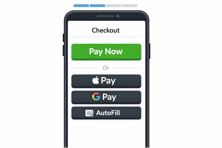
Leverage Mobile Payment Options
Offering mobile payment solutions such as Apple Pay, Google Pay, Samsung Pay, and PayPal can drastically reduce checkout friction. These methods enable single-tap payments and eliminate the need for users to manually enter billing information, making the process faster and more secure. Digital wallets also build customer confidence by allowing them to use familiar, trusted payment options. According to Statista, digital wallets have seen significant adoption, underscoring the importance of supporting these features in your mobile checkout design.
See also: How Technology Innovation Shapes Modern Business Strategy
Incorporate Progress Indicators
Progress indicators guide users through the checkout process, offering transparency and reassurance. Visual cues that show which step the user is on, and how many remain, alleviate anxiety and make the process feel more manageable. Use clear section labels, such as ‘Shipping Info,’ ‘Payment Details,’ and ‘Review,’ so customers always know what to expect next. Progress bars or breadcrumb trails are popular visual elements to achieve this.
Implement Real-Time Error Handling
Real-time error messages and validation help users swiftly correct mistakes as they fill out forms. Clearly highlight any issues, such as invalid credit card numbers or missing fields, and provide actionable, specific guidance to resolve them. Avoid forcing users to submit an entire form before revealing errors, as this can be discouraging and frustrating, leading to higher abandonment rates.
Ensure Security and Build Trust
Shoppers are wary of sharing their payment information on unfamiliar platforms. Clearly display security badges, SSL certificate indicators, and concise, easily accessible privacy policies to instill confidence. Use only secure HTTPS protocols and ensure all sensitive data is encrypted. Showing customer reviews, affiliation with trusted organizations, or clear refund policies can also reassure first-time buyers and foster trust.
Continuous Testing and Optimization
Mobile checkout optimization is an ongoing process, not a one-time project. Conduct regular usability testing, heat mapping, and analytics review to identify bottlenecks or friction points in the user flow. Implement A/B tests across elements such as button styles, field layouts, and payment options, and use the results to guide design refinements. Learning from real user behavior and feedback helps businesses iteratively improve upon the checkout experience. By adhering to these best practices, you can drastically improve the usability, speed, and security of your mobile checkout process. Optimizing each aspect of your checkout not only elevates customer experience but also drives measurable gains in conversion rates and business growth.
Conclusion
A well-optimized mobile checkout experience is no longer optional, as it is a critical driver of conversions and customer satisfaction in today’s mobile-first world. By focusing on responsive design, simplifying forms, and using clear, intuitive calls to action, businesses can significantly reduce friction and prevent cart abandonment. Enhancing the process with mobile-friendly features such as digital wallets and autofill further streamlines the journey, enabling users to complete purchases with confidence. At the same time, balancing usability with trust and security ensures that customers feel safe sharing their information without unnecessary obstacles. Continuous testing and refinement are vital for keeping the checkout experience aligned with evolving user expectations and behaviors. Ultimately, a seamless, efficient, and user-centered mobile checkout not only boosts immediate sales but also builds long-term loyalty and encourages repeat purchases.
